Divorce is one of those subjects that evokes significant emotion. Now that I am officially middle aged, the number of my friends and family that have had to suffer through divorce is growing. It is an event that no one plans for, but still happens at startling regularity. The interest in the state of failed marriages has led to a large amount of research on the topic. Unfortunately, lack of understanding of data has led to a large amount of misinformation.
If you have ever heard anyone mention divorce statistics in the news, church, or casual conversation you have likely been told that 50% of all marriages in the US end in divorce. Everyone who considers marriage is inevitably concerned with the likelihood of lifelong success. To this end, a simple percent statement of failure is easy to digest and understand. However, the divorce failure rate is incredibly misleading. Such a general statistic strips the nuance away from the truth of reality.
Pinning divorce rates into aggregate failure likelihood is an excellent example of bad data analysis. Social scientists that conduct formal studies do not use this metric, and prefer to measure divorce rates based on population (per 1000), or likelihood over a time horizon (i.e. 5 years). Stating an aggregate failure rate leads an individual to internalize the statistic and believe that it either directly applies to themselves or their circumstance writ large. It is clear that the 50% statistic is a sensational data point intended to influence belief about the condition of modern marriage. It creates a neat talking point inferring that marital success is left up to a coin flip.
Let me help dig into the actual raw divorce data (I have made the data available below for those that want to answer their own questions). Such data are collected both by the CDC and in peer-reviewed publications based on large surveys [1] [2]. I will focus only on the CDC data as it is authoritative.
This post could be called ‘why conditional probability is important’... but then no one would read it :). What I am going to show are a series of ‘conditions’ about divorce data that make aggregate interpretation misleading. The first, and most important, thing you need to know about divorce rates is that it greatly matters who you are. Specifically conditions of primary interest are your age at marriage, gender, education level, ethnicity, how many times you have been married and state of residence.
Let’s start with state of residence. Each state (with a few exceptions) reports two annual statistics to the CDC, marriage and divorce rates per 1000 people in the population. The two maps below show the marriage rates (left) and divorce/annulment rates (right) in each state.
Marriage Rates (left) and Divorce Rates (right) in 2012
|
|
|
As you can see from the maps there are a few places where marriage is very popular (Nevada and Hawaii) but divorce is much more uniform. This means quite a few people travel to get married but separate at home. Because these two states have small populations, they have a skewed marriage rate. The national rates reported in 2012 are 6.8 marriages and 3.4 divorces per 1000, which supports the 50% divorce statistic. However, this average removes much of the geographic story. The following plot shows the amount of divorce per marriage in each state in 2012 (excluding states with no data, and the outliers Nevada/Hawaii).

The primary idea that the chart shows is that less than one third of states have a rate that is within a +/- 5% interval of 50%. Many states are extremely different. Living in Iowa during 2012 you only experience ~3 divorces per 10 marriages. However, if you reside in Arizona that number is closer to 7 or 8 separations for every 10 marriages. There are some simple reasons for the range in numbers. For example, separation legally occurs in your state of residence not where you physically got married. However, the point remains that a small minority of states can claim something close to a 50% divorce rate, just ask Mississippi. Also, aggregate numbers subsume information about multiple marriages. This means that those who have multiple marriages/divorces move the average up for the entire population.
It is also worthwhile to view this information over time. The following chart is an animation of state level marriage and divorce data over time (the last decade). The ‘rate’ values are per 1000 and the divorce percent is the same as the above plot. You can explore trends in your own state or compare against national values. The plot is completely interactive so feel free to change the view to your liking (you'll need to have flash).
The major take away from this visualization is that the states represent significant departures from the national average. Some are better and some are worse, it is an excellent picture of variation.
Now let us move to the data that are much more individualized. The CDC’s National Survey of Family Growth (NSFG) is an authoritative data set, which has key factors concerning marriage, divorce and other individual specific information. The plot below is derived from the NSFG and shows the likelihood of divorce given a set of different individual traits. I have separated out men and women for comparison sake. These rates are based on statistical estimates of the likelihood of a divorce over the first 10 years of marriage.
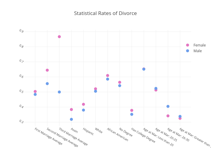
There are some interesting insights in this data. The most obvious is that only a few categories have something near a 50% divorce rate. The difference between how many marriages, education levels, ethnicities, age at marriage all present a broad range of rates. Changes in these simple factors result is significantly different outcomes.
From now on whenever someone tells you that 50% of marriages end in divorce my hope is that you think about how untrue that is at the individual level. Some people are very likely to stay married (Asian's in Iowa that get married in their thirties) and some are not (Women in Mississippi on their third marriage or people from Arizona who get married in their teens). There is a broad life lesson here as well, never accept an average as evidence with out understanding the variation underneath.
All of my visualization code and data files can be found here: https://github.com/isaacfab/divorce_blog