There is a small war raging on the streets of America. It seems like a never-ending narrative; police clashing with local communities. One side of this coin is law enforcement and the other, the populations they serve. The primary problem with most mainstream analysis is that it focuses on only one side. Either victim advocacy reigns or law enforcement justification prevails. Very little work is done comparing these two areas. The hope here is to put into context exactly who is in the greatest mortal danger from whom.
A set of complied data, from a number of sources is used to make this comparison. First, data about victims of law enforcement is from the Fatal Encounters database (here). This data source is not authoritative but seems to be more comprehensive than the CDC or FBI offerings. There are, however, some major drawbacks with this dataset, which includes all deaths caused by any law enforcement officer regardless of circumstance. This criteria includes deaths caused during domestic violence or off duty actions. Secondly, for police deaths, the FBI’s Law Enforcement Officers: Killed and Assaulted (LEOKA) database is used(here). Finally, the census data is used for population normalization. Please keep in mind that all figures are my calculated statistics from raw data and should be treated as approximations.
This first visual compares the major category of interest, race. This chart compares yearly average total killings. For example, on average, 332 African Americans are killed by police and also are responsible for killing 24 law enforcement officers.
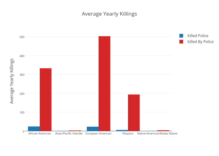
The total amount of killings can be somewhat misleading. One would expect police to have a lower casualty rate in general. After all, police are highly trainied and are typically well equipped which provides an advantage in life threatening situations. The following video is an example of one such situation where police intervention leads to a death (graphic). Another view shown on the chart below compares the racial categories, by percent contribution, to the total amount of killings. For example Hispanics are responsible for 10.5% percent of those that kill police and also constitute 18.7% percent of those killed by police.
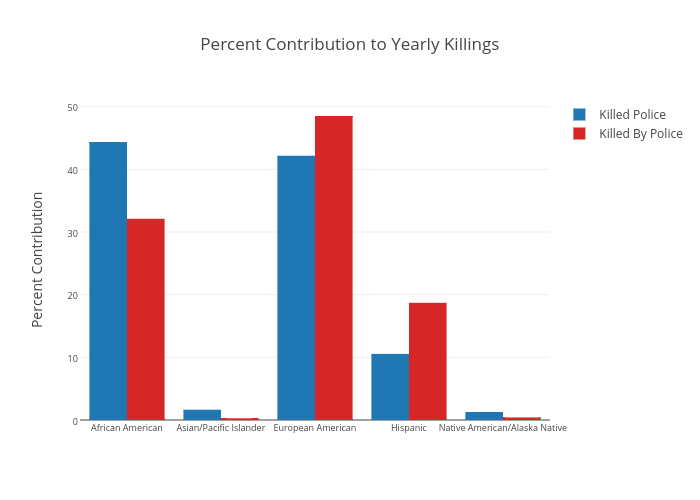
A comparison of the first two charts show that, yes, police do kill more than they are killed. However they do not target any particular group disproportionately. The deeper question as to why there is so much killing remains unanswered (unanswerable?). However, the risk profile for both sides of the coin is mostly even; police are killed by the same race in proportion as they kill. The following table includes average yearly fatalities and the percent of the US population for each race along with that groups contribution to killing percentage.
One major observation is that, concerning African Americans, both victims of police and police killed are well above the population proportion. This phenomena is better viewed, as compared to other race categories, on the chart below.
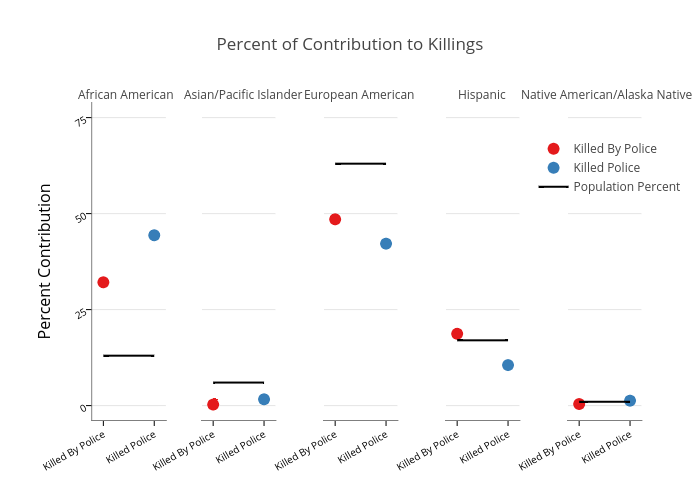
If police were killing people without regard to race one might expect the percentages of people they kill to be equivalent the portions of race in the general population. That is, if African American's are 13% of the general population, we would expect 13% of the people the police killed to be from this category (or at least something statistically insignificant). Instead, it is 32%. On the other hand, if the police are being killed without regard to the race of the killer, we would expect 13% of the police killed to be killed by African American. Instead, we finds that it is 44%.
The last major consideration is a view of victim population normalized data for each category. This will allow for the comparison of police related killings agains all murders. All races (and law enforcement) in the United States have varying total population sizes, the amount of killings is best viewed with this in mind. The chart below shows how many, conditioned on a groups population, murders are expected per year as caused by another group. The data is separated and sorted by killers and victim groups.
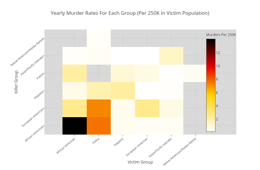
What immediately jumps out is that African Americans lead the population normalized averages for both victims and killers. This is primarily due to the large amount of murders that take place within this community. What is also of interest is that police are second in victims and only fourth in the killer group by totals. An example interpretation is that a police officer is more than three times as likely to be killed by an African American than to kill one (7.5 vs 2). This comparison is derived from the population discrepancy (40M African Americans compared to 809K police). Another interesting observation is that an African American is almost 10 times more likely to be killed by a white person than vice-versa (2.55 vs .24).
What is clear from this review is that an obvious problem exists. The riots in Baltimore are a visceral example of what the data has shown. Law enforcement and the African American communities are locked in an adversarial relationship that out weighs all other groups. This remains a challenge for our time.
As always my code and data can be found here: https://github.com/isaacfab/police